
Airbnb Website Redesign
UI Design
TL;DR
I reworked Airbnb's existing design system into three distinct visual directions while preserving usability and documenting how the system could stretch without breaking.
Date
Jan 2025 – May 2025
Role
UI Designer
Tools
Figma
Google Docs
Methods
Competitive Audit
Web UX Heuristics
Research
Wireframe
Visual Design
Introduction
This project deconstructs an existing design system, analyzes its components and documentation, and reconfigures elements into new layouts. I also designed and documented an original component to extend the system.
Project Goal
Explore how an interface can shift across visual styles while preserving core functionality.
"Retro" Style
Pre-internet era inspiration (1970s-1980s).
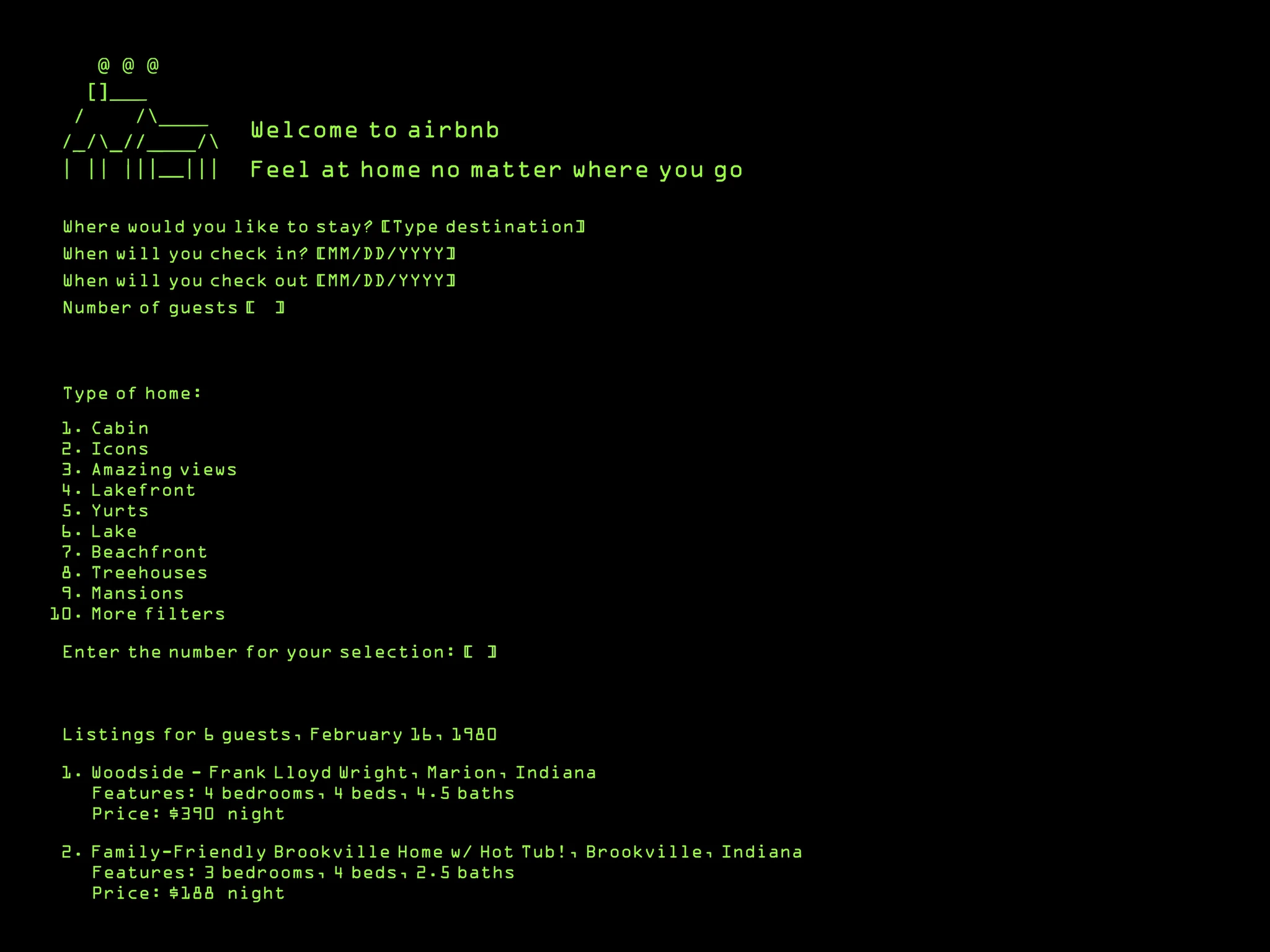
Why I Choose Certain Design Elements
The typography was inspired by the era of pixel-based fonts in early video games like Zork.
I researched the colors used in early computer displays and found that green was the most common due to technical limitations and cost efficiency.
Why It Works And Why It Doesn't
The design works by using ASCII art for Airbnb's branding and following the command line structure for navigation, maintaining user experience.
However, it may not be fully effective due to the limitations of ASCII art in presenting information clearly. Adding more could overwhelm the design.
Parallel Contemporary Style
Brutalism-inspired contemporary design.
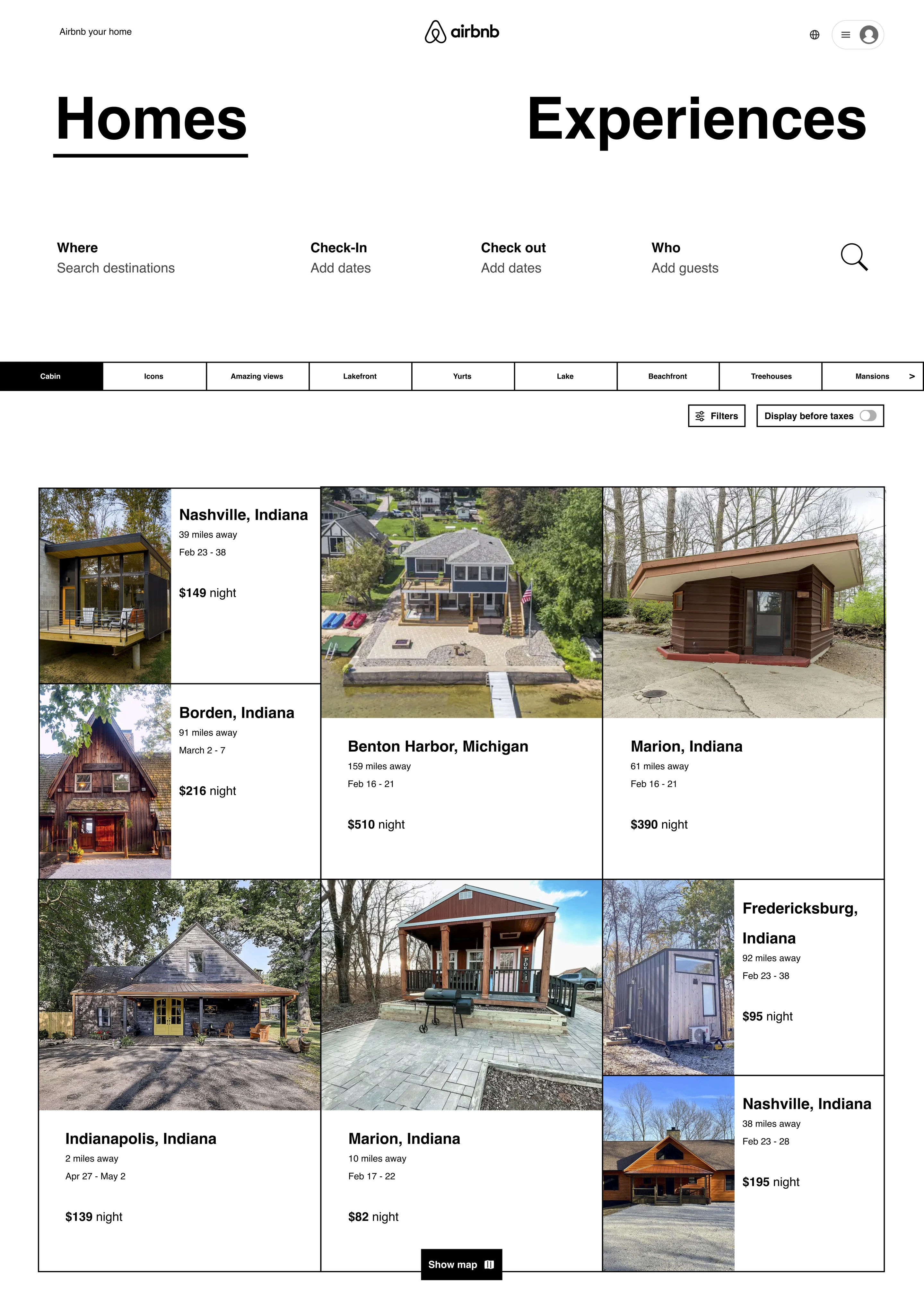
Why Brutalism
I envisioned a brutalism-inspired redesign with a minimalist, raw style, using simple elements, no shadows, and visible grid systems for structure. The monochromatic design enhances navigation and creates a bolder aesthetic, offering a contrast to the polished look of modern interfaces.
Why It Works And Why It Doesn't
The brutalism-inspired design emphasizes functionality with bold, large text for key sections, improving navigation and offering a unique aesthetic. However, it may overwhelm users with its boldness, potentially increasing cognitive load and affecting booking rates.
Future Style
Future-leaning concept inspired by holographic and 3D interfaces.
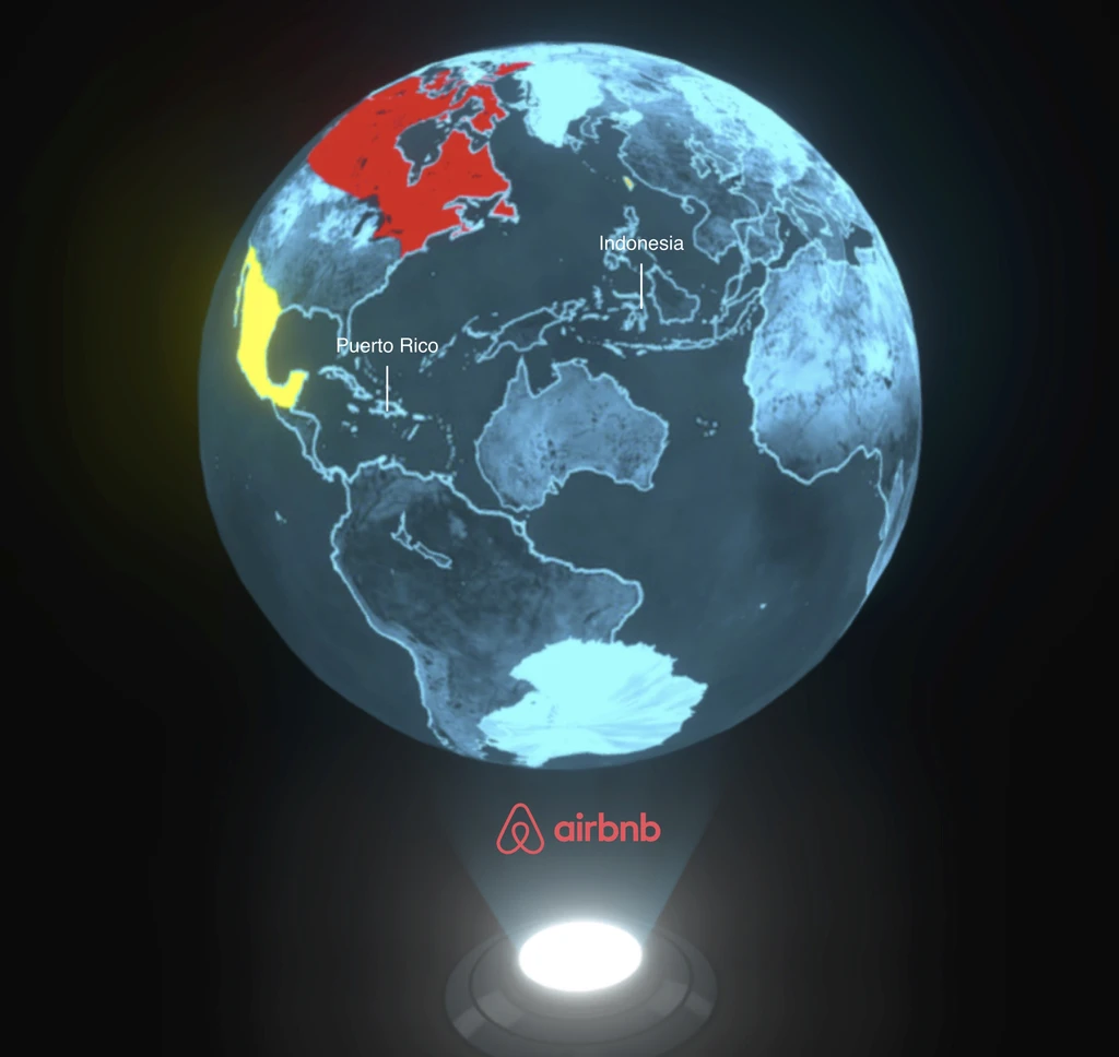
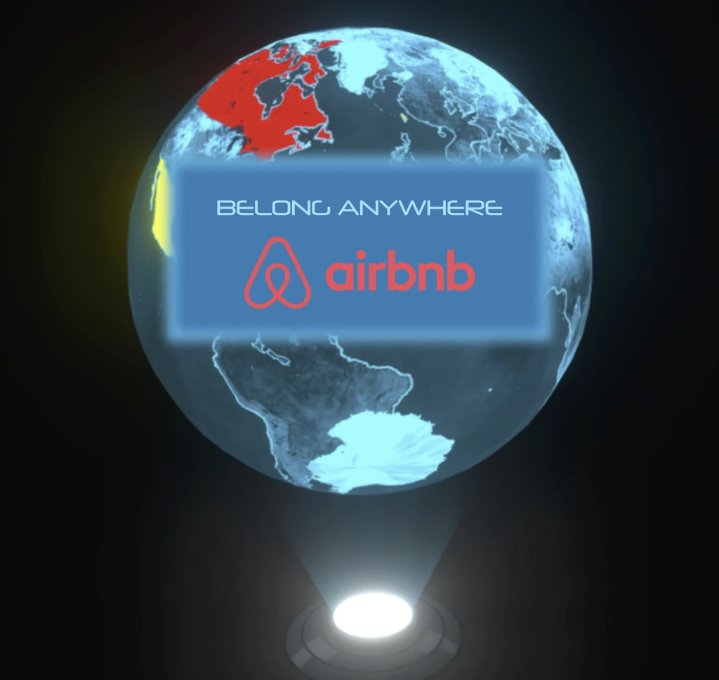
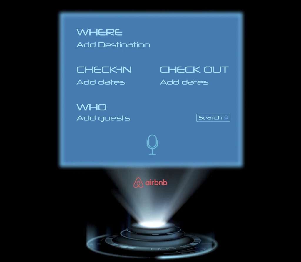
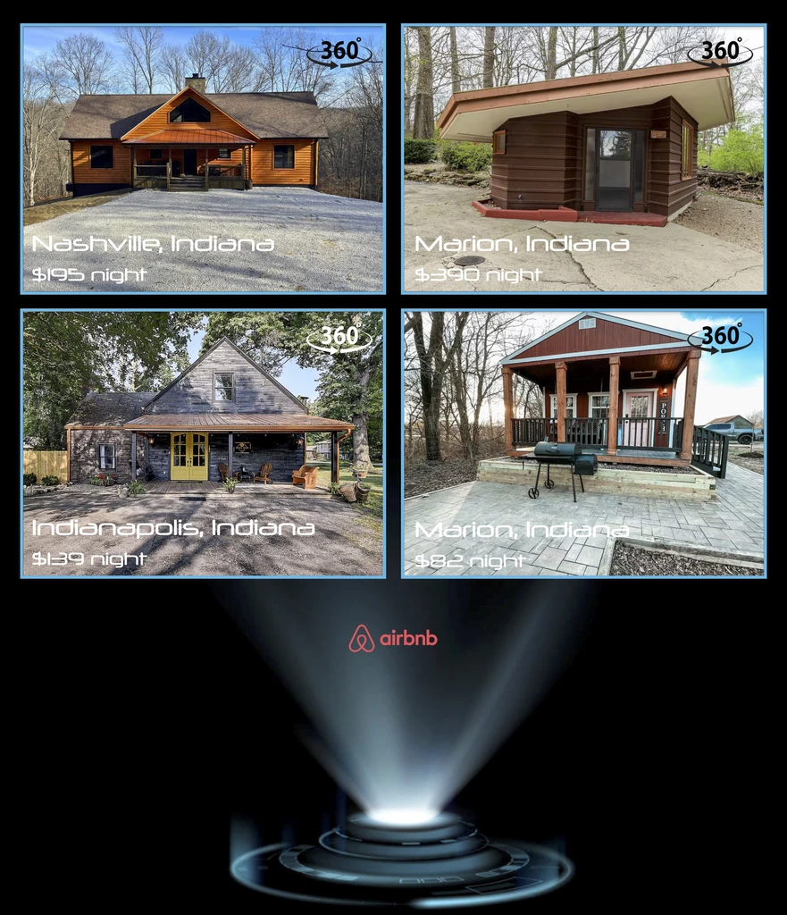
Why I Choose Certain Design Elements
I envision holographic projectors or 3D interfaces as the future of information search, predicting travel details based on user data. Inspired by sci-fi and cyberpunk aesthetics (Iron man movie), I chose futuristic typography and blue for its association with trust and intelligence.
Why It Works And Why It Doesn't
The system works by automatically identifying preferences and predicting travel details, making it easier for users to interact without typing. Voice options and 3D immersion enhance the experience. However, privacy and lighting issues may arise, and the limited information that can be displayed on a projector might lead to cognitive overload.