MyNeighbor
UI Design | UX Design
TL;DR
I designed a nonprofit website concept that makes MyNeighbor feel trustworthy, warm, and easy to navigate so visitors can quickly understand the mission and how to help.
Date
Jun 2023 – Present
Role
UI Designer
UX Designer
Tools
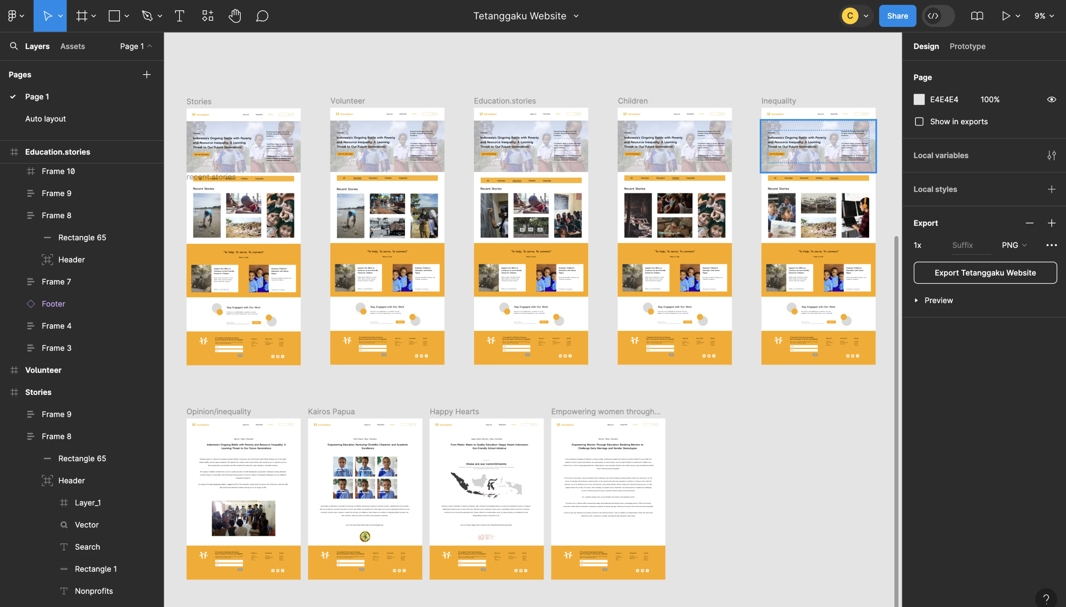
Figma
Methods
Research
Wireframe
Introduction
MyNeighbor is a nonprofit platform that helps individuals share resources with people in need, building connections across communities from the U.S. to Indonesia and beyond.
Challenge
This was my first UI project built from scratch. The challenge was balancing visual warmth with clear navigation and trust-building content so visitors could quickly understand the mission and how to help.
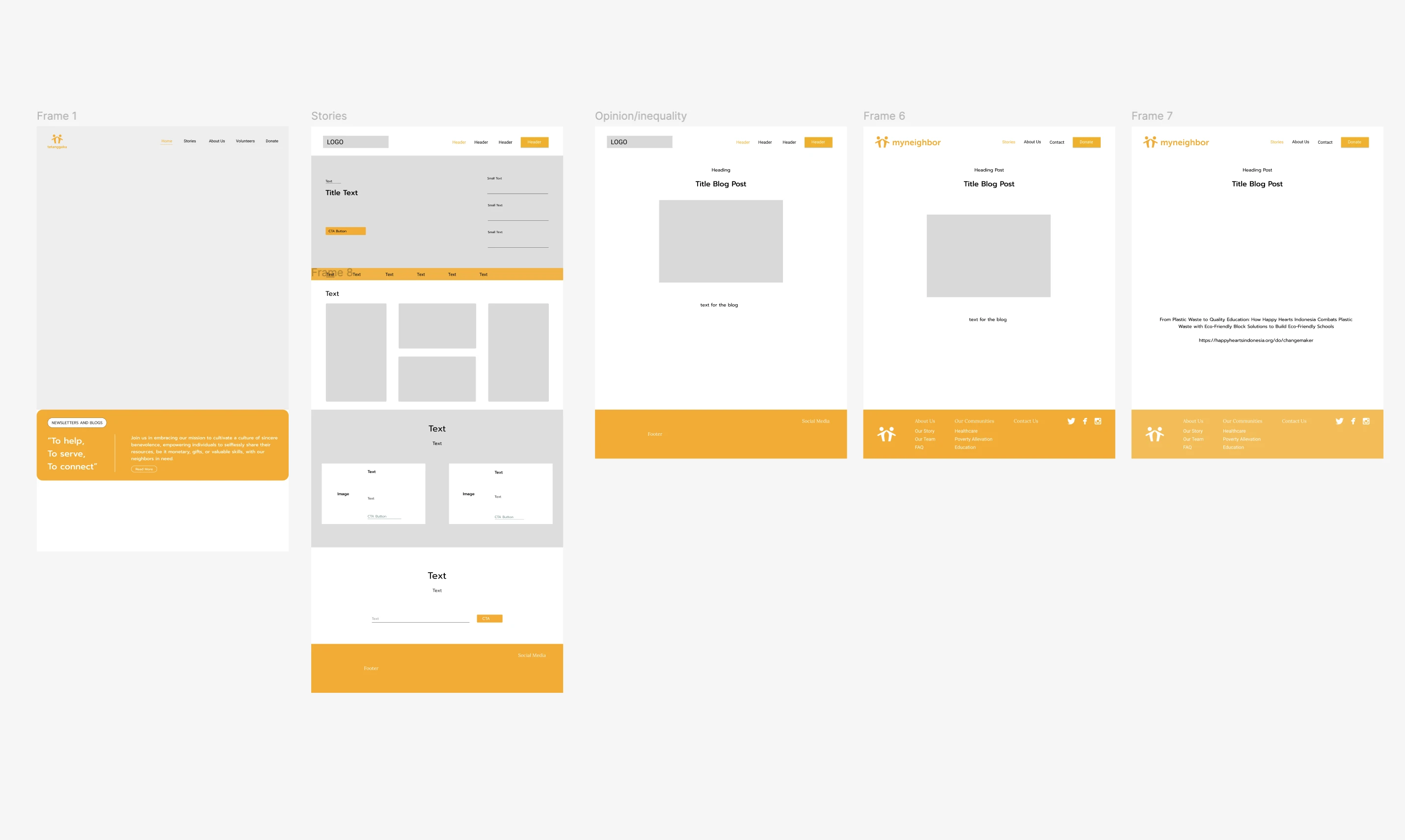
Wireframe
Low-fidelity wireframes focused on navigation clarity, donation pathways, and content hierarchy.
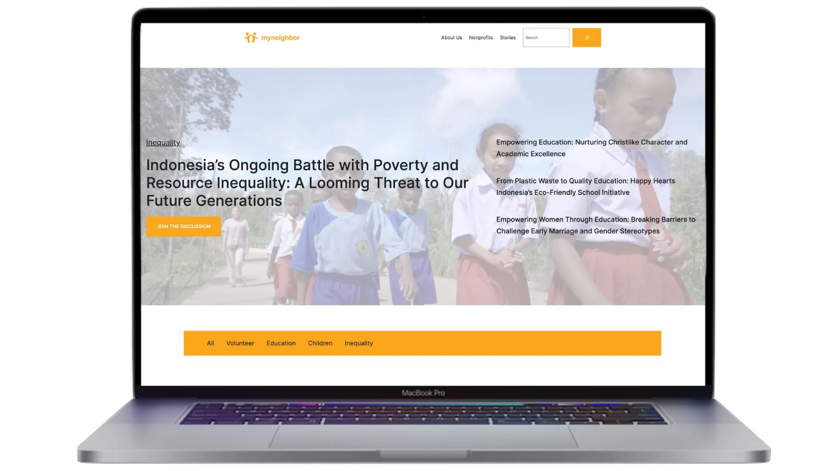
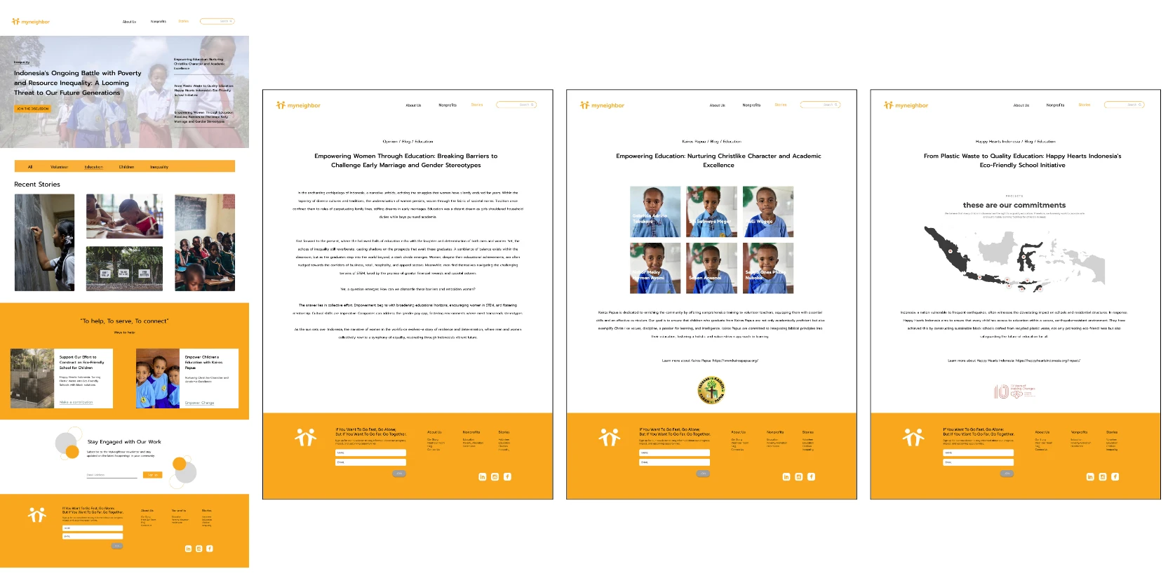
Hi-Fidelity Mockups
High-fidelity screens refined the visual tone, typography, and calls-to-action to make the nonprofit's mission feel credible and approachable.
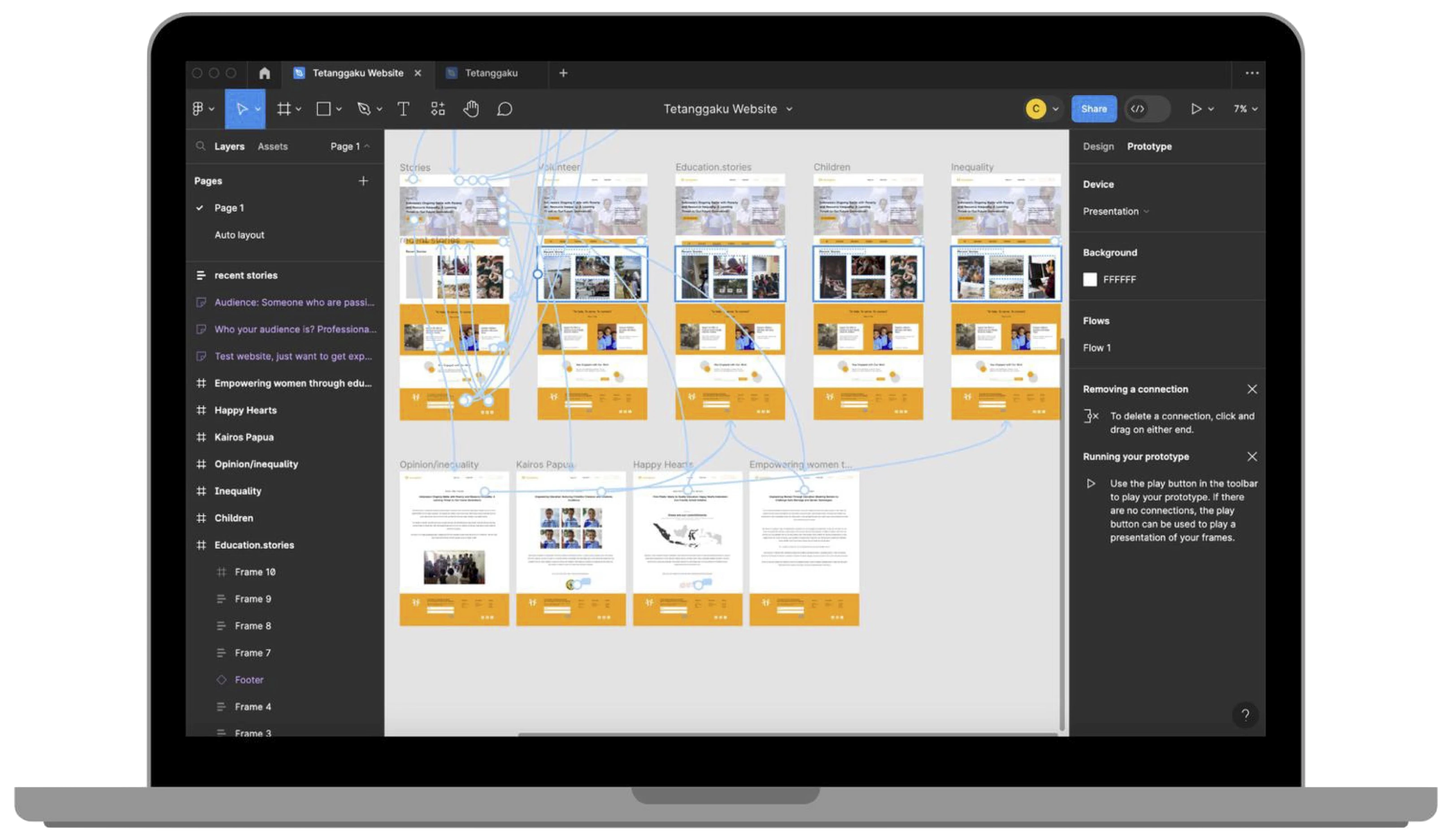
Flow
Solution
The result is a user-friendly interface with intuitive navigation and clear labeling. Next steps include usability testing to validate flows and iterate based on feedback.